Wasmer Art Gallery
Faculty Mentor, Andy Owen
April 24 - May 10, 2014
At the end of their studies, each art major completes a senior project in which he or she successfully executes a body of work combining their knowledge of techniques and concepts while drawing on research of historical and contemporary artists. The completed projects are presented in an exhibition open to the University community and the general public. Associate Professor of Art, Andy Owen is the faculty mentor for this group of graduates.
-
Jessica Dehen CONTEMPLATION
Toggle More Info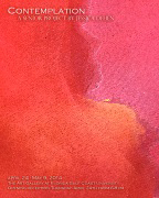
Color is one of the many means that artists use to express themselves in their artwork. An artist’s use of color will ultimately lead to the overall feeling and message behind a work of art. And while there are many artists that use color to represent objects as they exist in the natural world, I believe a greater, and more meaningful challenge, is an artist’s use of color to represent a thought, feeling or emotion that does not tangibly exist in the physical world. My body of work envelops several conceptual notions behind the power of color. After researching artists such as Mark Rothko, Jules Olitski, Helen Frankenthaler and Jane Booth, I sought to explore the divine significance of color in relation to both the viewer and myself. My work aims to stimulate a spiritual response in the viewer through its exploration of the spatial relationships, perception and emotional impact of color. I developed a fascination with the idea that art doesn’t have to be ‘of’ or ‘about’ something in particular; rather it can just be something in itself and still potentially arouse an emotional reaction and spiritual awareness in the viewer.
It has always been entrancing to me that color holds the power to determine a person’s emotional response to a work of art. I have spent the past few years of my life willfully searching for my artistic voice and figuring out what I have to “say” in my artwork. Unfortunately, doing so has always led to a great deal of frustration with myself because I didn’t exactly know what I wanted to say. And while the medium, content and style of my work continuously evolved with time and experience, there was one factor that always remained constant—this profound fascination with color. While I’ve always adored the work of Mark Rothko, I had never really felt a Rothko painting until I was standing in front of one, inches from its’ surface, at the Metropolitan Museum of Art in New York City. As I stood in front of this painting, I couldn’t help but feel something. It was an emotion that I couldn’t pinpoint; a captivating sensation that enveloped me—this spiritual response. The incredible thing that I’ve recently discovered about spirituality is that it means something different to everyone. For some people, it means praying to God, for others it means going to their temple, church or mosque or simply living a peaceful and loving life. But for me, spirituality has always been this divine relationship between me and art, whether it be that of my own or the work of others. While for some, going to church is the channel through which they get closer to God, for me, color is the channel through which I am able to explore my relationship with my artwork. Eventually, it was this unnamed emotion, this sense of spirituality that sparked in me a desire to explore the transcendent nature of color in my own artistic voice. I wanted to discover what color meant to me, subject matter aside, and let color serve as the vessel through which a viewer interprets my work.
My works were created from large pieces of raw, unstretched and unprimed canvas. All of my pieces were done using Golden Fluid acrylics that were diluted with water and a flow enhancer. Diluting the paint enhanced the colors’ abilities to bleed into one another and allowed for interesting color interactions to occur when layering. The paint was poured onto the canvas and spread out using both a large squeegee and my hands. The process of making this body of work was just as significant as the finished product, if not more. I felt that using my hands gave me the opportunity to really feel and respond to my materials. Spray bottles of water were used to keep the acrylics wet and fluid. Other materials that I used to apply paint were rags, sponges and bristle brushes. The process of creating this work was intimate and one of the most important aspects was giving myself an opportunity to have a conversation with the pieces. The canvas was laid out flat on the ground and full body movements were used to apply the paint. Layering different colors over one another is what lead to the rich, atmospheric quality of my paintings, each piece having at least 15-20 layers of paint.
-
Kate Dupre I WANT TO RIDE MY BICYCLE
Toggle More Info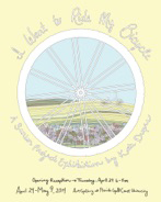
I Want to Ride My Bicycle is a project celebrating the role that bicycling has played in my life. I have ridden literally thousands of miles throughout my lifetime, and while I may have previously taken its benefits for granted I am now attributing my cycling experiences as a core contributor to my personality and to my happiness. The movement of muscles, fresh air, energized focus and solace– I am happily addicted to riding my bicycle. Cycling allows me to escape external pressures and become fully absorbed in an activity for intrinsic motives. I want my life to resemble this kind of experience. About to exit my college experience, I continue my journey of concocting and engaging in happiness, resisting negative influences, opposing mediocrity, and following whatever I dream. I want to ride my bicycle; I want to ride it where I like.
For the first part of my project, I have created six posters each featuring a bike I have owned. These posters individually illustrate my life at that time, depicting the bike as a uniquely valued character. Intended to be read as a chronological timeline, the sequence demonstrates personal maturation; the ranging illustration techniques suggest self discovery. The other portions of my project– the animation and illustrated map– depict my more recent bicycle rides (throughout the past four years) in the Fort Myers area. These recent rides have helped me gain greater insight into my identity. Despite the deep discoveries, the lightheartedness of my work here is intentional. Just like a bicycle ride, my work escapes the seriousness of facades in exchange for a breath of bliss. This kind of simplicity is exemplified in the animation portion of my project. I chose to segment different mechanics of the bike in order to articulate the rhythmic clarity that I achieve through bicycling.
Not surprisingly, I was most inspired for my project during a bike ride, so that is where my creative process begins. I utilized Adobe software– primarily Illustrator and Photoshop– to create all of my illustrations. Certain subjects in the posters were hand drawn, scanned and digitally altered. The map poster features hand-lettering produced in this way. These phrases on the map are directly from a journal record of thoughts I have while riding, along with kindred ideas I've encountered. The six bicycle images required a pedal down memory lane. I referred to photographs of each actual bike that I owned. All the elements in these bicycle illustrations are quite deliberate and carry personal meaning. The digital animation elements were designed in Illustrator and composed in Adobe After Effects. I had no prior experience working in After Effects until this project. However, I was adamant about my project including dynamic imagery parallel to that of a bike ride. It is notable that during the creation of this entire project I frequently entered a psychological state of flow quite similar to what I achieve while bicycling.
-
Mariana Griswold REBRANDED
Toggle More Info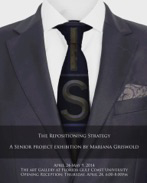
My work consists of the creation and repositioning of the brand identity, logo, website and slogan of Investors’ Security Trust Company. The current logo, slogan, and website appear out dated; I felt that incorporating a modern look would be a more beneficial approach. The project components consist of a redesigned logo and 3 magazine advertisements that are not only relevant to the company but to the magazines themselves. These components are the products of extensive research that includes target market, colors and font in relationship to marketing, as well as creating a brand identity while still maintaining the essence of the firm itself. The goal of the project was to form a realistic approach to how brands are revived and created. I also believe depicting the process was just as imperative, if not more, to the end result. Numerous components are involved when molding the brands consumers know today. Citizens associate their status and overall lifestyle with the brands they buy. When items are purchased and slogans and logos are recognized, the work involved is often overlooked. My senior project is about the process and how I ended up with the finished products. I believe consumers should know and at least recognize the thought that goes into the brands we know today as well as the many steps behind forming their identity.
As an art and marketing major, this was the first step to my relationship with this particular project. Instead of focusing on the fine arts, I felt that it would be more beneficial to put myself in a real life situation. I decided to reposition a brand and implement advertisements in various magazines that are based on true demographics that I had researched. I explored different fonts and colors that correspond to this particular brand and used this information to come to a conclusion. The style of the finished design implemented both a modern look, yet, a traditional structure. I believe this represented the company most efficiently. When I began the website, I constantly thought about who would be looking at the site, the most convenient way to access the information, and why they would look at it in the first place. I felt that the company needed a modern look in order to grow with their clients. I wanted to place myself in a realistic scenario and chose a company that could be a possible prospect in the future as well as a company who is actively involved in the Fort Myers community. In an attempt to make this scenario as realistic as possible, I also received input from one of the associates who work at Investors’ Security Trust Company. This allowed me to further understand more about the business, the client and what their needs are, as well as explaining why my design and ideas work best for their company.
For this project, I first sketched out ideas for the logos and then I painted them in order to experiment with different colors and fonts that I wanted to use. Once I received feedback from my client, I further developed 4 designs in Photoshop. I then asked the client which design they liked the best and how they would improve it. This led me to the final design. Using demographics, I researched what cities housed the most amounts of clients and based the magazines I chose from that information. When creating the actual advertisements, I used Photoshop and InDesign. I used some of my own photos, yet some of them I bought online (many advertisements use images from online photo stores, such as Gettyimages.com in order to prevent copyright infringement). In order to create the website, I used an online source known as Wix.com. I do not need to host my own website, and I am able to use their domain to have it published. In order to print the final logo and magazine layouts, I sent them to Staples to have them printed.
-
Julianna Javier OCEANIC CONNECTION
Toggle More Info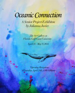
The environment is important for all living things and we rely on it for all of our natural resources. The biggest asset to our environment is the ocean, which covers over 71% of the planet’s surface and is a major source for food, oxygen, medicine, and transportation. My senior project is about the interconnection between the environment and it’s subjects. I have produced a series of pen and ink drawings that express six aquatic species as a part of the environment, and the environment as a part of them. The ink washes are used to express the beauty of the ocean, and made visible through the subjects to demonstrate their dependency on the environment for their resources. Through the transparency and dependency of the animal, the environment becomes a part of the subject. Within this exhibition, I want to express how influences on the ocean also create a strong impact on the subjects that rely on it through their connection. Since we rely on the ocean for multiple resources, I believe it is important that we respect and take care of it. The health of animals, people, and the environment rely on a harmonious relationship within our connection.
I grew up by the ocean almost my whole life, so it has become my sanctuary. I find the ocean very inspiring because of the unusual and exotic animals that live in its vastness. My imagination runs wild at the fact that over 95% of the ocean is undiscovered. During my college education at Florida Gulf Coast University, I have developed a strong sense of place and a stronger passion towards the environment. I learned so much about the importance of our actions and how the health of the environment relies on it. I strongly believe the way we treat the environment is vital to all living things including the human race. My concept and beliefs also strongly relate to concepts and ideas produced by transcendentalism, a philosophical movement that sprouted during the middle of the 18th century. It is the idea that through intuition, people know themselves and about the world around them in a way that transcends the senses. It expresses the idea that people truly know within themselves what is right and should trust their own authority. Transcendentalists also believe in the concept of the divine and how it is within everyone and everything therefore, connecting us all as a whole. I believe through the cycle of life, we are all connected.
This body of work consists of six drawings produced with pen and ink. Four drawings consist of 22” x 30” rag paper, and two are 30” x 22” rag paper. The ink was brushed on expressively so that each piece creates its own unique composition. Multiple layers of colorful washes and splatter marks were produced with large, size 12 and 10, flat brushes to create the background of the artwork. I used more concentrated inks to produce coral like effects, and other accessories to create some texture within the washes such as; sea salt and paper towels. The light colored washes were watered down, brushed on in layers, and blended into each other to produce multiple colors. The illustrations of the animals were drawn with micron, slicci, and prismacolor pens, with the technique of cross-hatching to create detail and patterns. The subjects are drawn with pen so that the light colored areas are perceived as negative space, and the washes are visible through the subject.
-
Marisa Schreiber INSTINCTS OF ABANDONMENT
Toggle More Info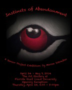
The work I have created is centered on instinctual responses to abandonment. Abandonment can be anything from divorce, loss of a loved ones life, being left somewhere alone, or even being left alone by parental neglect. Research shows that our responses to these life events is the feeling of constant underachieving, fear of being alone, never feeling loved, longing for attention, and in the worst cases Borderline Personality Disorder. For the case of Blizzard, the Bengal Tiger depicted in my work, she was left at a vet’s office because she had a crushed skull when she was born and the breeder decided he couldn’t sell her. Over the past few years I have frequented Octagon Wildlife Sanctuary and become very close with Blizzard. I feel as if we are connected at a higher level, as if I know what she is thinking. Our communication is through our eyes. I believe that not only are the eyes the window to our souls, but they tell what we want, what we’ve been through and how we feel. This work is an attempt at capturing what both Blizzard and I have been through and what we are feeling.
This work is a direct expression of my biggest flaws, the days where I feel as if I have under-achieved, am not loved, not noticed, and will be left again. These flaws, as I call them, are all a result of being abandoned. From a very young age, I had already experienced several instances of abandonment. My biggest blow in abandonment however, came when I lost the most important woman in my life, the woman who raised me for the first few years, my Namu, who passed away a little over a year ago (age 22). My Namu didn’t only raise me; she was my North Star, my guidance, and my biggest role model. Through Blizzard, I feel as if I share her pain, and have endured the same emotions, and our eyes hold the stories we have to tell. My intent is that the monotypes and the paintings will communicate my emotions enough so that the viewer can distinguish the connection, creating a narrative between the two. Each color used has been selected based on personal intent as well as the psychological emotions they represent. For example red represents anger and rage, which is what is felt towards those that abandoned you. Purple can represent introversion and inferiority, much like the feeling of never being good enough for oneself or for others.
I developed my paintings by creating a series of black and white charcoal drawings and then slowly started to add color. I decided that by using a very limited palette the color will speak louder than it would have if Blizzard were painted in her natural color. In addition to the paintings of the eyes, I’ve also included monotypes that connect to the paintings by way of color and emotion. Each eye that I have painted will match a monotype print that has a single color (that matches the eye in the painting) and a silhouette of a tiger in the body language that expresses the emotion. The silhouette of the tigers in the monotypes are drawn with a mixture of acrylic paint and black India Ink.
-
Mary McBeath SPIRALS INSPIRED
Toggle More Info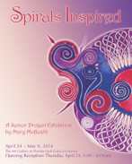
The most widespread shape in the natural world is the spiral. It forms the shape of our galaxy, DNA, embryos, and hurricanes. Plants rise and bloom from the ground toward the sun in a spiral motion. Smoke from a lit fire winds itself in upward curls, its shape responding to the interaction between air and heat. By definition, a spiral is “a plane line or curve generated by a fixed point while consistently receding from or approaching it.” A spiral’s spin can expand outward growing larger, or become smaller by tightening inward. One example of the use of the spiral can be found in early ornament started by civilizations such as the vessels and wall paintings of the Myceneans, as well as in the Early Celtic Christian insular art. It is also a symbol of multiple dualities: ascent/descent, evolution/involution, increasing/decreasing, expanding/contracting, offering/receiving, revealing/hiding, just to name a few. This duality has also been recognized as a symbol of personal transformation of psychological, spiritual, or natural journeys through life.
Throughout my personal journey through the art program at FGCU, I have changed schools, and majors, ridden the waves of life outside the academic world – and all of it has involved dualities of nature, both positive and negative. This journey of personal growth with my Art has traveled in the motion of a spiral. The process of creating art has helped me reach inward to grow outward, and while reaching out, it has helped me refocus on the most important points. In particular, the Celtic spiral resonates with me, due to my primary ancestry leading back to the Britannic Celts. Compass in hand, like the Celtic scribes, I am taken into a creative time warp, guided by my tool to undertake a new drawing; its destination: unknown. Starting at a single point, the compass seems to guide my hand in different directions, every step following an organized method, every curve a rhythmic pattern, until a spiral is born. Each spiral, shape or color intrigues me, and as I add more layers of detail and color, following this magnetic method, it is as though I dive into the mysterious force of the spiral itself.
Spirals are products of sacred geometry and number equations within universal language. Therefore, in this series, I will draw eighteen spiral drawings, as 1 + 8 = 9, and the number 9 itself is shaped like a spiral. I enjoy working on a smaller scale of 5 x 7, on 300 lb Arches cold press paper. I initially sketch the drawing in pencil, layering it then in watercolor paint, following with more layers and shapes filled in with mainly watercolor paint, incorporating some acrylic paint. Each painting was inspired in a different way – some by color, idea, mood – but all are related by the spiral shape. I hope to invoke primarily a sense of Fun and enjoyment in my little paintings, and possibly a new awareness of the mysteries of this simply complicated shape and directly gentle energy, which exist around and within the peaks and troughs of the wave every individual is currently riding.
-
Megan Mosallem REBRANDED
Toggle More Info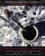
The ideas embodied within my work are based around psychological and philosophical aspects of life. It is common for a person to struggle with stress, self doubt and self identity but without suffering, one cannot grow or get the peace and happiness they deserve. The philosophy of Buddhism states that we should embrace our suffering and let it reveal the way to peace. Liberation from suffering comes by training the mind. Carl Jung, a Swiss psychologist theorized that the psyche, the human soul, mind or spirit, consists of three parts; the conscious, the personal unconscious and the collective unconscious. Jung attributes artistic and philosophical bursts of inspiration to ideas stored in the collective unconscious. He theorized the collective unconscious as the most important part of the mind because it provides the human race with archetypes – instinctive trends. The archetypes mostly control the emotions of state of mind. Jung felt the most important archetype in human personality was that of the self. When the self is fully developed, a connection is formed between the conscious mind and the unconscious mind.
Discovering and exploring my personal archetypes to create my path of enlightenment is the essence of this body of work. To embrace my sufferings, as suggested in Buddhism philosophy, I’ve delved down to the depths of my soul. Each painting sitting is served as a therapeutic session where I allow myself to do what comes natural to me, gesturally. I allow my body, my hands, my tools and the flow of the paint to create different marks, shapes and textures under an unconscious thought. The direct, instinctual, spontaneous marks illustrate the corners of my mind. Confronting the self through the personal unconscious mind is something I will continue to explore. Attempting to form connections between the conscious mind and the unconscious mind to fully develop the self is what I hope to accomplish. When I look at my work, it is best described as a portrait of my soul.
Using house paint, I created multiple layers and textures on nine panels made out of masonite to create one large piece. Although this piece is separated into several different panels, I work on all the panels at once as one whole piece. Because there are numerous layers and disorder within my work, I chose to construct nine individual panels to create structure and divinity within the chaos. Each layer is applied by different techniques that I’ve previously experimented with or new techniques inspired by Abstract Expressionism. Within the layers of my piece, the idea of process and discovery is prominent. Uniting the sense of process and discovery is a distinguishable ring serving as the unifying element of the painting. For exhibition, I decided to display this piece in a grid format, using nearly 64 sq feet of wall space. By doing so, I aspire to create not only a painting but an installation and presence within the gallery.
-
John Povlitz ALL HALLOW'S EVE: THE WARY CARETAKER
Toggle More Info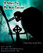
The time is around 12th century Ireland, on the night of All Hallow’s Eve. On this dark, cold night, under a full moon’s light, the cemetery has become restless with the spirits of those who wander aimlessly back into the world of the living. Amidst the graves, by the ruins of an old Celtic tomb, on top of a cross a poor soul sits and looms. Chilled to his bones from fear and fright, he holds up his lantern that shines nil light. It was the lowly caretaker who once walked these lands – loyal to his work from the dirt on his hands. He watches this tomb, so cold and sheer, he wonders why he’s here only one night each year. Watches he does for spirits to come out, but alas, there seems to be no one about. The plaque with the family name was poor and unkempt, leaving the knowledge of who’s buried there exempt. He continues to sit, all wary and alone, forever not knowing that this tomb is his own. From dusk ‘til dawn this night each year, he dwells alone in loneliness and fear. A time will come when he learns the truth, that he is now dead and must accept his sooth. For now he will sit on top of that cross, the caretaker he was, where his soul is now lost…
As a child growing up, Halloween was always my favorite time of the year. I would always be told scary ghost stories of spooks, ghosts and goblins – along with a wide variety of old horror films of the mummy, Dracula, Frankenstein, etc. Back in those days, when I went out trick or treating, the houses were decorated with webs, real carved pumpkins, tombstones, and ghosts – everything that suggested that the yard/house was haunted. It had an eerie feeling, and I loved it. As the years went on, while I was growing up, I began to take great interest in where the holiday originated from. Where/when did it start? What did it involve? What were the stories and traditions of the holiday? What would it have looked like back then in comparison to what I learned as a child? Through my work, I would like to share with others the original traditions and stories of Halloween as well as give people a better understanding of how in-depth the holiday actually is by portraying the symbolism and traditionalism of the objects in question and how are they related to Halloween: why a turnip lantern? Why Celtic architecture and the symbolism of the carvings? How does the scene tell the story of the wary caretaker…
Because this scene revolves around 12th century architecture, I wanted to demonstrate the use of certain materials and methods to simulate the effects of aging through weathering and eroding. Using pink/blue insulation foam as the templates, combined with the use of a wood burning tool (hot knife) for the carving, varied grits of sandpaper for the sanding of the edges, and a heat gun for texturing, allowed me to recreate the weathering effects of old sandstone which was choice for building in Ireland during those times. Since this scene is also to portray a sense of Symbolism and Traditionalism of All Hallow’s Eve, I’ve incorporated some of the more eerie yet natural forms of weathering along with some of the well-known symbols related to the holiday itself to give the viewer a good feeling of what Halloween is about and how it ties in with the story being portrayed in the scene.
-
Robert Pavon SINFUL NATURE
Toggle More Info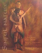
The idea of sin is something that is popular in today’s culture. In fact it has been a popular theme for hundreds of years. Looking back at the old masters one can see the intense interest in sin and sinful acts. Many artworks of the past revolved around the depiction of sin and its consequences. Sin does not always revolve around religious beliefs but rather they are a set of activities looked down upon because of their potential to hurt rather than help a society. You do not need a religion to know when something is socially unacceptable. The sinful nature of our species is something I find fascinating, maybe this is because I am human and commit sin on a daily basis. Maybe it is because of the frustration we feel about not being able to live up to such high standards set by others or ourselves.
What I finally decided to depict in my paintings is choice. I believe ultimately that sin is a choice just like any other part of our lives. Although I found the idea of sin more interesting to depict than say the opposite of sin which is virtue. I felt that this was too confining and probably very overdone. Virtues are something I had a hard time finding references on which was discouraging as it made me feel as though we are so consumed by our sinful ways that this is the only thing we understand. I am telling a story of the choices and emotions we feel when faced by these choices. I tried to put on canvas my own personal views of how I feel and think others might feel about a given choice. I also did not take the easy route and what I felt was the boring route in my composition. The route I took with my depictions pays homage to the masters of the past and present by the use of symbolism with nudes. The heavy use of nude forms harks back to renaissance artist like Michelangelo and Da Vinci. I felt that the naked truth over which we all as a society are faced with should be reflected by the nakedness of the human form.
I like to work in layers when I paint and usually wet on wet. This is a common form of painting where one uses layers called glazes of thin paint to get the color you want. I always start with a black and white graphite sketch. I go over that sketch with charcoal to darken it and add values by smudging it with my fingers. I take the drawing to a very finished state because I use it as my grisaille. Some grisailles are done in paint but I find that this technique is much faster and just as good. I then fix the drawing with final fixative so it will not smudge when paint is applied. I follow that with a thin wash to the background and a thin wash of burnt sienna and a touch of alizarin crimson for the flesh. Using a dry blender brush I go over the flesh and even it out. This will also remove excess paint from the flesh. I do these washes in acrylic so it will dry fast. I then place a fan in front of the painting to speed up drying time. Two hours later I apply the darks and mid tones to the head, blending as I go to smooth out the brush strokes. I work only in small areas leaving them finished before I move on. For mid tones I use yellow ochre, vermilion, white, and a touch of black. For the lights I use vermilion with white and yellow ochre with white. These two highlights are placed while paint is wet and blended in. At the second sitting I repeat the process or only apply the highlights that were obliterated in the last step.
