

Color Me Accessible: Use of Color & Color Contrast
November 09, 2026 / Digital Learning / Tags: Accessibility, Digital Learning, Access Granted
Have you ever used bright red to flag an important deadline, green to indicate a correct answer, or a light gray font to give supporting information less emphasis? These decisions may seem like simple design choices, but for some students, they can make course materials harder to read or navigate.
Understanding the Issue & Impact
Accessible use of color involves two key considerations:
- Not relying on color alone to communicate meaning
- Ensuring sufficient contrast between text and its background.
Accessible use of color supports students with low vision or Color Vision Deficiency (colorblindness) who may experience difficulty distinguishing colors or reading low-contrast content. It also improves readability on mobile devices, in bright environments, or on lower-quality screen displays. When color or contrast makes information difficult to perceive, students may miss important content or expend unnecessary effort that takes their focus away from learning.
Color contrast refers to the difference in perceived brightness between two colors, such as dark text on a light background. The Web Content Accessibility Guidelines (WCAG) establish minimum contrast ratios to help ensure that digital content is readable. For standard text, the recommended minimum ratio is 4.5:1. Large text (at least 18 points regular or 14 points bold) requires a minimum ratio of 3:1 (W3C). These standards provide measurable criteria rather than relying solely on visual judgment.
Example
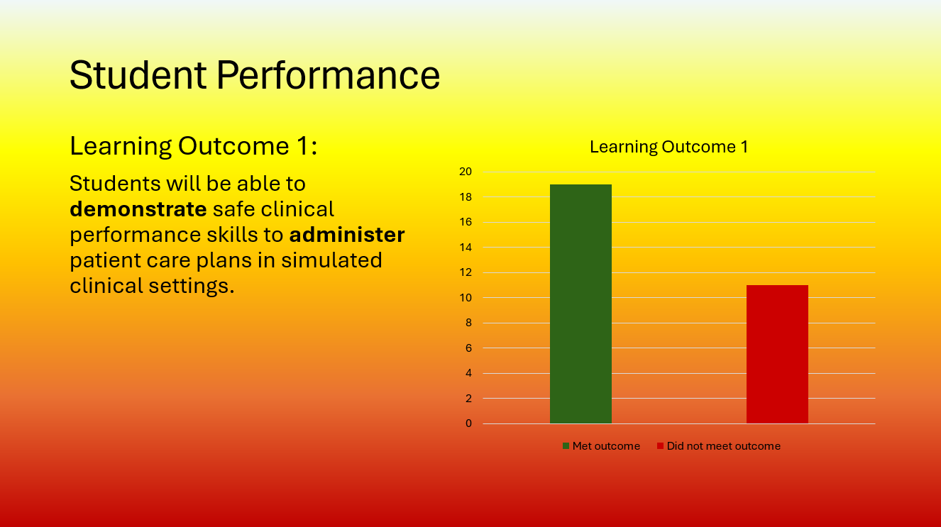
Consider an instructor who shows this lecture slide comparing student performance across two groups. The instructor uses a green bar to represent students who met a learning outcome and a red bar to represent those who did not. A student with red-green color vision deficiency will have difficulty distinguishing the bars. Moreover, if the slide background is similarly bright, it may be difficult for students sitting in the back of the classroom to distinguish the chart information from the slide’s background.
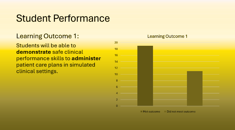
Consider: This is a simulation of what this lecture slide would look like to a student with Red Colorblindness.
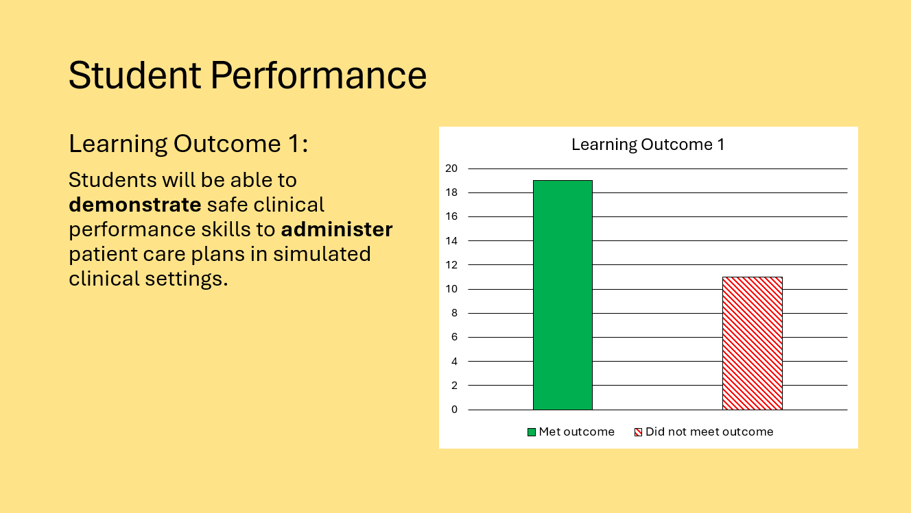
To make the chart more accessible, the instructor could use different patterns in addition to color to differentiate between the two columns. Adding a background color to the chart could also improve readability. To improve color contrast of the overall slide, the instructor could use a solid, light background color that provides sufficient contrast with the dark text. These changes preserve the instructional purpose of the visual while making the information more accessible to students.
Put It In Practice
Instructors can incorporate several practical strategies into their everyday content creation:
- Do not use color as the only way to communicate meaning. When presenting information, combine color with other visual indicators like bolding or italicizing for text or different patterns and symbols for charts.
- Choose readable color combinations. Dark text on a light background and light text on a dark background provide strong contrast. Black on white and white on black are the most accessible color combinations.
- Check contrast before publishing. Most content creation software, including Canvas’s Rich Content Editor (RTE) and Microsoft Suite products, have built-in color contrast checks. The aforementioned software are especially helpful as they suggest alternate, more accessible colors to use. You can also use free tools such as the WebAIM Contrast Checker to evaluate text and background color combinations. Aim for a ratio of at least 4.5:1 for standard text and 3:1 for large text.
Moving Forward Accessibly
Accessible use of color doesn’t mean removing color altogether from your materials. You just need to make sure you are being intentional with color by using accessible color combinations and providing multiple visual cues for important information.
By incorporating these practices into routine content creation, we can help reduce barriers and create learning environments in which students can more readily engage with course materials.
Want to Dig Deeper?
- Try uploading screenshots of your course content into the Coblis — Color Blindness Simulator to see how a person with Color Vision Deficiency would view your content.
- Learn more about the related WCAG Guidelines, 1.4.1 Use of Color and 1.4.3 Contrast (Minimum), from AAArdvark’s WCAG in Plain English.


